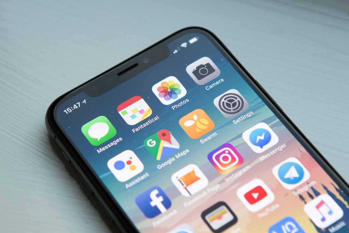
South Africa has a mobile internet penetration rate of over 90%. If your website isn't built mobile-first, you're designing for the minority.
South Africa is a Mobile-First Nation
In many countries, mobile overtook desktop a few years ago. In South Africa, mobile internet has dominated for over a decade. More than 90% of South African internet users access the web primarily via smartphone — often as their only connected device.
Yet we still encounter business websites designed desktop-first, with mobile treated as an afterthought.
This is a fundamental strategic error.
What Mobile-First Actually Means
Mobile-first design isn't just making your desktop site 'responsive'. It means:
- Designing for the smallest screen first, then scaling up
- Prioritising touch interactions over mouse clicks
- Loading critical content first, deferring everything else
- Writing content that reads on a 375px screen without scrolling horizontally
- Testing on actual devices, not just a browser resized window
The Cost of Getting This Wrong
A poor mobile experience doesn't just frustrate users — it:
- Destroys your Google rankings (Google uses mobile-first indexing)
- Kills conversions — users won't fill out a form with 2mm-wide buttons
- Damages brand perception — a broken mobile site signals an out-of-touch business
- Increases bounce rate — users leave immediately and don't return
What Makes a Great Mobile Website?
Navigation
- Hamburger menu that's easy to tap
- Sticky navigation so key CTAs are always visible
- No dropdowns that require precise hovering
Typography
- Minimum 16px body text (smaller feels cramped on mobile)
- Short paragraphs — no walls of text
- Enough line height (1.6+) for comfortable reading
Forms
- Large input fields with big tap targets
- Numeric keyboard triggered for phone numbers
- Minimal fields — less friction, more conversions
Images
- Appropriate crops for portrait screens
- Art direction: different images shown on mobile vs desktop where needed
Speed
- Mobile users are often on data, not WiFi
- A slow mobile site is a dealbreaker
Google's Mobile-First Indexing
Since 2021, Google has indexed all websites using their mobile version. This means your SEO performance is determined by your mobile experience — not your desktop experience.
If your mobile site is broken, slow, or stripped of content, your rankings will reflect it.
How to Audit Your Mobile Experience
- Open your website on your phone — not simulated, actually on your phone
- Run Google's Mobile-Friendly Test
- Check your Core Web Vitals for mobile in Google Search Console
- Ask someone who didn't build the site to find your phone number in under 10 seconds
UNION Design Builds Mobile-First
Every website we build starts at mobile. Our design process begins at 375px and scales up — not the other way around. The result is websites that perform where your customers actually are.
Contact us to discuss your mobile experience.